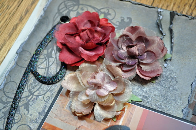
This time, for the third course of the Techniques Course #1 series, we had to create a layout using distressing techniques, paper scrapper, sand paper, distress ink, stains, eyelets and brads (using the Big Bite, which I finally acquired :o)). This is such a great tool, and I waited for such a long time before getting it! I'm like a man getting his first power tool :o).
So... this is my very first vintage looking layout. When I created this layout, I knew this is what I wanted to do: vintage scrapbooking! I like every type of scrapbooking, but the one style I LOVE and that I enjoy doing the most is vintage. Here it is:
I remember not following the proposed layouts when I created this one, simply because I was so inspired by the pictures of my wedding celebration! I used chipboard swirls that I covered with stickles, black soot Ranger's distress ink, and beautiful Prima flowers. Of course, I couldn't resist adding one of Tim's amazing keys!
This year, for that same course, I decided to use some very nice pictures of my son playing guitar and reading music. It amazes me what my 8 years old boy can do with his instrument, having so much fun playing music on it!
So here is the vintage layout I created for Nicholas:
 |
| 'La Musique dans l'Âme - base on an original layout from Josée Lalonde (SEM) |
Since I just got my Big Bite, I decided to put in some eyelets and use burlap tread on my layout. I used 'black sout' (my favorite I think!) and 'aged mahogany' distress inks. Adding corrugated letters added to the overall atmosphere of rustic/simple/peaceful time I spent with my son. This little boy has such a natural talent with music!
Now, this is the kind of layout I truly enjoy doing! Whether it is grunge, romantic or nostalgic vintage, I just love it.
Of course, some journaling to complete the layout, and voilà! If you like this post, leave me a comment!
Until next time, happy scrapping!


Love everything about this! Thanks for sharing Nathalie.
ReplyDeleteLorena
www.scrapingcorner.blogspot.com
Fabulous and love it!
ReplyDelete<3!
cool layout!those corrugated letters are so versatile.I'm sure Nico loved it :)
ReplyDeleteOf the 3 evolution pages, this one is my personal favourite. They are all very nice but this one grabs me. The pictures are fantastic and vintage look makes them look even better.
ReplyDelete