Thursday, July 19, 2012

Evolution 5

Hey there! Here is my fifth post of my Evolution series.  My intention is to get to six, so hang in there for those who don't like these posts!  I'm almost done!

This time, I decided to post the picture of the layout I made recently first, as opposed to the other posts I wrote on the same subject.  So this time, the main challenge from the techniques class was to use the colour wheel to create our layout.  The principle is simple: using the colour wheel, find the triad of colours that fit your pictures the best.  The application of this principle: not so simple.

You must have concluded by looking at my layouts (see my gallery or older posts if you need), that I am rather a 'vintage/sophisticated/grunge' kind of scrapper.  So to be imposed colours by a so called wheel is out of my element, to say the least!  In both cases, i.e. in both times I attended that class where I was imposed colours, anxiety showed up in my chest and stayed there until I was done.

I have to admit, the result is not bad.  Not my cup of tea, but not bad.  So, here is the layout I made this summer during my SEM Scrapbooking Techniques class #2.


Mon Jardin Secret, completed July 16, 2012

So the first time around, I also had to use the colour wheel for this class.  I chose pictures of my daughter at 3 months old, when I visited my parents for a week.  Of course, I didn't know that my dear Papa would pass away a few days after that class, when my pictures and paper was picked using the colour wheel.  I have to admit, it took me quite a few months before I was able to even start this layout, but I did it, with a lot of pain and tears.  I like this layout though, and it reminds me of how my Father was an amazing Grand-Father.  He loved his grand-children like his own children.  Ok, I am digressing here.  So here is the layout I created in the summer of 2011.

De l'Amour plein les bras, completed in July 2011

This layout also gave me a hard time with the colours I had to work with, but I love it.  It is now in my daughter's album.


And here is the guilty colour wheel.  Kidding!  This tool is amazing and can assist any artist, including scrapbookers or cardmakers, in choosing colour combinations that will always succeed.  No wonder painters, interior designers, and other professionals make it their #1 tool.  It just takes a little bit of time and help to know how to use it at first. 

And once you know, you're good to go!
Happy colouring!

Monday, July 16, 2012

Evolution 4

Hello Friends! It has been six long weeks since I wrote on my blog... life got busy, that's the least I can say! But here I am, full of energy and with a lot of new layouts and fun stuff to share with you.

I am back from France where I spent two wonderful weeks visiting Paris and the Loire Vallée with my hubby. Of course, I took over 600 pictures, just to make sure I have enough scrapping material to keep me busy for the next 5 years!
So, being back home also means being back to preparing classes for Scrap en masse, my favorite scrapbooking store! I started a series of posts on the theme of evolution where I presented layouts I did during the course 'Technique de Scrapbooking #1 / Scrapbooking Techniques #1', which by the way will be given in English this fall.

Now I am presenting the layout I made for the second part of the course, 'Technique de Scrapbooking #2 / Scrapbooking Techniques #2' (same links as above). The first session of this series of 3 courses aim at combining stamping techniques along with creating a doilie and following specific guidelines in a layout.  Here is the layout I created last year, when I first took the class:


Based on an original layout created by Josée Lalonde (SEM)

I have fond memories coming back at me when I see this layout, as it reminds me of the wonderful visit my family and I had in Victoria. We also visited Butchart Gardens, which is by far the most beautiful flower garden I've ever seen!

Since I could not find a doilie that matched my photos, I created one by cutting a big circle and punching smaller circles that I crumpled with my fingers and then sanded.


We also used background stamps to created a cool effect on the white cardstock. Since I also wanted to include pictures of the flowers I saw, I re-sized four of them into 2x3 wallet size pictures using PhotoShop Element and combined them on a single 4x6 mat. I few embellishments clustered around, et voilà!


This time around, I created a totally different 'look' using the same layout. I made this girly looking layout for my very girly daughter. She loves it!

Based on an original layout created by Josée Lalonde (SEM)

Again, I made my own doilie, this time using the hearts that were on one of my papers.  I cut them with scissors and inked them with Walnut Stain distress ink.

I found this cute girl chipboard in a sale bin at SEM. I painted it and added a few coats of glimmer glam to give it a glittery effect. I embellished it with pearls and flowers.


I used the new sew stamping around my page, I love how it turned out!


Finally, I used a beautiful background stamp and spayed it with goosebumps texture spay, a very cool product that adds texture to any surface. You can see it on this picture. I used a beautiful die designed by cheery lynn designs, a company that I just discovered and that creates some truly amazing dies!

I hope you enjoyed this post! Happy scrapping everyone!


Friday, June 1, 2012

Evolution 3

Hey there friends!  Well it's time for another 'evolution' post, since I had a few layouts done lately, and a fourth one on the way!

This time, for the third course of the Techniques Course #1 series, we had to create a layout using distressing techniques, paper scrapper, sand paper, distress ink, stains, eyelets and brads (using the Big Bite, which I finally acquired :o)). This is such a great tool, and I waited for such a long time before getting it! I'm like a man getting his first power tool :o).

So... this is my very first vintage looking layout.  When I created this layout, I knew this is what I wanted to do: vintage scrapbooking!  I like every type of scrapbooking, but the one style I LOVE and that I enjoy doing the most is vintage.  Here it is:


I remember not following the proposed layouts when I created this one, simply because I was so inspired by the pictures of my wedding celebration! I used chipboard swirls that I covered with stickles, black soot Ranger's distress ink, and beautiful Prima flowers.  Of course, I couldn't resist adding one of Tim's amazing keys!


This year, for that same course, I decided to use some very nice pictures of my son playing guitar and reading music.  It amazes me what my 8 years old boy can do with his instrument, having so much fun playing music on it!
So here is the vintage layout I created for Nicholas:

'La Musique dans l'Âme - base on an original layout from Josée Lalonde (SEM)

Since I just got my Big Bite, I decided to put in some eyelets and use burlap tread on my layout.  I used 'black sout' (my favorite I think!) and 'aged mahogany' distress inks.  Adding corrugated letters added to the overall atmosphere of rustic/simple/peaceful time I spent with my son.  This little boy has such a natural talent with music!


Now, this is the kind of layout I truly enjoy doing!  Whether it is grunge, romantic or nostalgic vintage, I just love it.


Of course, some journaling to complete the layout, and voilà!  If you like this post, leave me a comment!

Until next time, happy scrapping!


Wednesday, May 30, 2012

Evolution 2

Hi there everyone!  Since I'm on a blogging roll, might as well keep going.  In my previous post 'Evolution 1', I mentioned this series of upcoming posts presenting some kind of 'before and after' layouts.  For more details, go read the post :)

So here is layout #2 I made during my first time taking the Scrapbooking Techniques #1 course series in 2011.


Based on an original layout created by Josée Lalonde (SEM)

The goal in making this layout was to learn how to use border punches and find the right paper to enhance our photos.  This might seem pretty simple, but for scrapbooking beginners, or those who don't have it in them to combine colours, this can be a challenge.  We also learned how to cluster our embellishments.


My sweet little Alyssa has just turned 2 weeks old on these pictures.  looking at this layout bring a lot of fond memories... isn't it what scrapbooking is about?  Absolutely!

So this time around, I made layout #2 about my son's 8th birthday.  Here is the layout I made for this same class: Call me MJ.

Based on an original layout created by Josée Lalonde (SEM)

My son Nicholas likes Michael Jackson's style very much.  So when he received the Michael Jackson's Experience Wii game from his big sister, he started dancing like MJ.  Good memories and great laugh.


Since this layout is all about fun, I used big chipboard letters that I sanded and embellished with baker's twine.


I used these cute bottle caps for a boyish look and embellish the layout!  Aren't they neat??

I hope you liked this post.  Thanks for stopping by, and happy scrapping!


Evolution 1

Hello dear readers! It's been a long (too long!) time since I had the occasion to finally sit down and blog! But here I am, with many creations to share with you :)

During the last couple of months, I have been busy creating and preparing for a very exciting life experience: teaching scrapbooking.  I have joined the Creative Team at Scrap en masse, a wonderful scrapbooking store located in Alfred, a little town 45-60  minutes from Ottawa.  I will be teaching  scrapbooking techniques #1 and #2, an upcoming series of vintage techniques and layout classes, and maybe a course on Dylusions.  I am really excited about all this!

In order to teach the two techniques classes, which I attended last year, I needed to take it again so I can learn the new content of this 6-day course.  However, most of the exercises are the same, with some variations, and I thought it would be cool to show you the comparable layouts.

The first layout is made of strips of papers that we combine to make the base of the layout.  Basic embellishment were used in this first layout.  So this is the layout #1 I made in 2011.

Based on a layout created by Josée Lalonde (SEM)


The new content of the first class now includes techniques to make handmade flowers, the use of glimmer mist and other medias.  Here is the layout #1 I made in 2012.


Based on a layout created by Josée Lalonde (SEM)

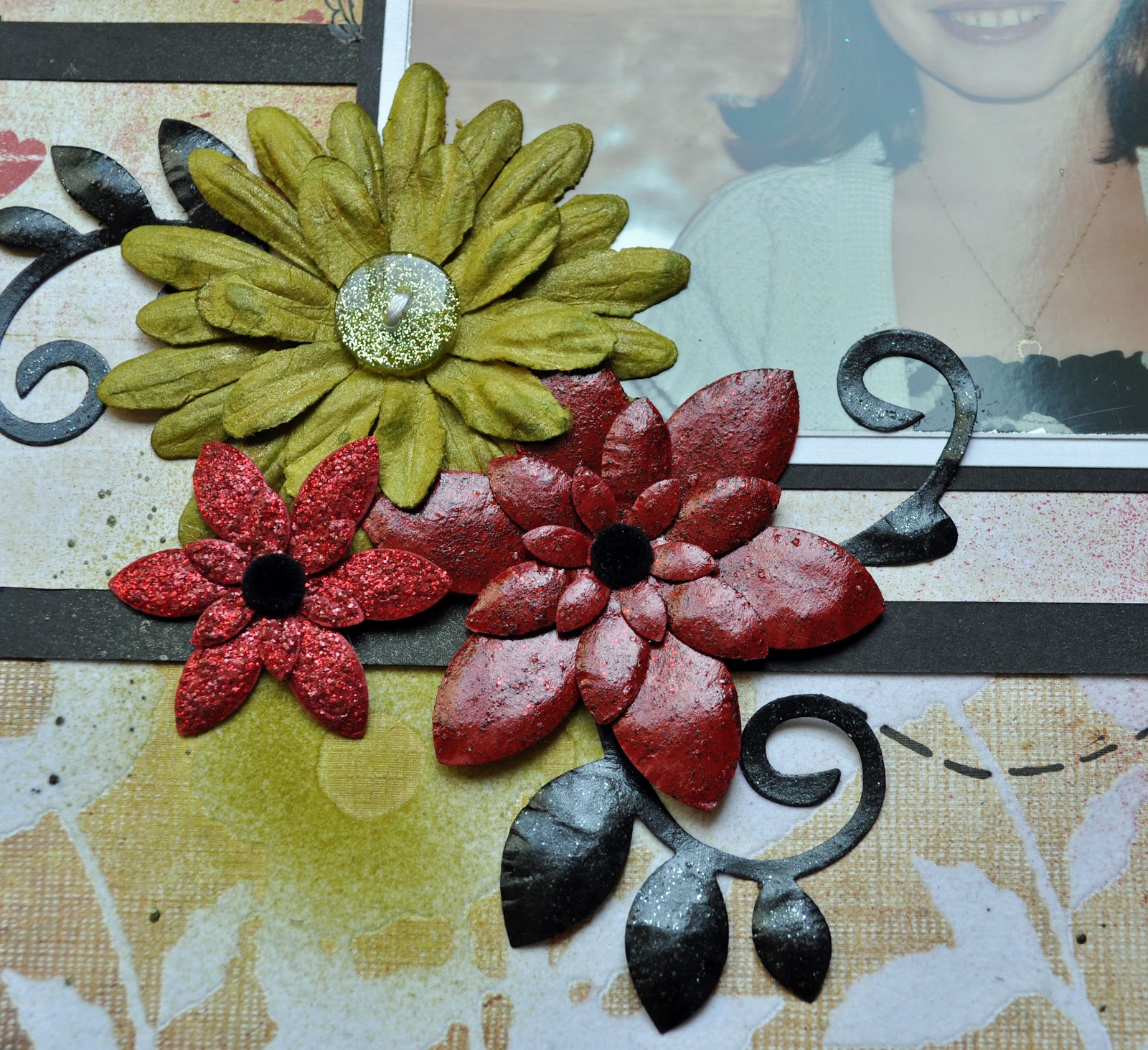
I like this layout, it is so colourful.  I added Apple and Red Velvet glimmer mist on my pages and flowers.  I also used glimmer glam on my red handmade flowers.


This post is the first of a series.  For each layout I created in my class the first time, I will write a post and compare it with my most recent one.

Let me know what you think, I always love hearing from you :)

Thanks for stopping by, and have fun scrapping!

Monday, March 19, 2012

All Those Pretty Paper Packs!

Every scrapbooker I know has an obsession. Some collect buttons, glimmer mists or brads, others hoard punches, flowers or ribbons. MY obsession is paper. Every time I enter a scrapbooking store, I loose all common sense when I get anywhere close to paper. This is actually the one scrapbooking goodness that made me fall in love with scrapping. Beautiful papers and I have a long term relationship.... I love the textures, the colours, the patterns, and they all seem unique to me!

Which can be problematic when the time comes to use them. I am afraid of cutting them, 'hurting' them, even opening a new paper pack feels like a sin to me. I have paper packs that I bought over a year ago that remained untouched. So this weekend, I took one of these leap of faith I was holding on to, and opened TWO brand 'new' packs, nothing less! Not so new in fact, as I am talking about 'Out of Print' from Basic Grey, and 'Et Cetera' from BoBunny. Some of my friends went through 2-3 entire packs each of Et Cetera in the last year, while I watched them, 'envy' them for having the 'strength' to open their paper packs and use them! I admit, I have issues.... :)

So by deciding to open these two pretty paper packs, I also committed to make one of the nicest layouts I ever made. I was not going to be broken hearted and regret this ultimate decision!

Here is the double page layout I made using papers from both collection (Out of Print and Et Cetera), as well as 2 pages of the beautiful 'French Kiss' collection from Glitz for the background page.


I love the romantic atmosphere that transpires in this layout, the colours and the multiple layers of paper I created. Here is a close-up of page 1.


As I often do, I distressed and aged the paper using distress ink and stain to give it a vintage look. I also made an opening in the corner where flowers are peeking out, as if they were growing behind the paper.


Here is a close-up of  page 2. This page took quite a few hours to create, as my head was blooming with ideas! I wanted to create a multi-layered layout because it makes me used many of the papers I like, but just in small pieces so I am left with plenty to use on other layouts! This is perfect for the paper lover that I am...


I painted swirls on one of my canvas butterflies (Maya Road) using glimmer glam (Tattered Angels), which I also sprayed with glimmer mist from the same company.


Of course, I couldn't create such a romantic layout without putting one of my favorites elements: the Tim Holtz keys are also one of my obsessions, that I preserve and use only on very special layouts or cards...


I hope you enjoyed this post. Please feel free to leave a comment, and share what YOUR scrapbooking obsession is!

Thanks for stopping by!

Wednesday, March 7, 2012

New DT projects

Last week, my Diva friends and I attended a crop in Dixon's Corner. We had a lot of fun and we created in a very relaxed atmosphere. This was a good place for me to be at the time, because I was tasked, as a design team member for Tina's Scrapbooking Creations, to create layouts with some paper collections that do not correspond to my usual style; I named  Karen Foster design hockey paper collection and Imaginisce Hippity Hop paper collection.

So, I had to think outside the box... to say that I was out of my comfort zone is an huge understatement!  To boost my inspiration, I picked some of my favorite pictures of the kids.  Here is what I created with the hockey paper.


Since I just love working with corrugated cardboard, I used plenty of it on this layout to give it a boyish and grungy look. I used black shinny cardstock that kind of gives a icy look to the background. I like the final result! This is more 'me' than I expected when I started working on it.

The second layout I made is a single page of my little sweetie when she turned 3 years old. She received a cute raincoat and hat outfit from my Mom for her birthday and played that 'going on a trip' game. Using some of the Imaginisce Hippity Hop paper and white dotted cardstock, I created a girly and childish looking layout.


I stamped here and there around the page using a Tim Holtz stamp to create some kind of a frame to the layout. I like the result, but it really forced me out of my comfort zone.  I'm happy I made it as my daughter likes it very much.

Thanks for stopping by!